Why UX Matters More Than Pretty Pictures
Beautiful design won't save an app that's inconvenient to use. According to Google, 53% of users delete an app after their first negative experience. Not because of colors or fonts — because of confusing navigation, slow loading, and unnecessary steps.
UX in 2026 is not decoration. It's an engineering discipline that directly impacts retention, conversion, and LTV. Companies investing in UX achieve ROI up to 9,900% (according to Forrester research).
Minimalism and White Space
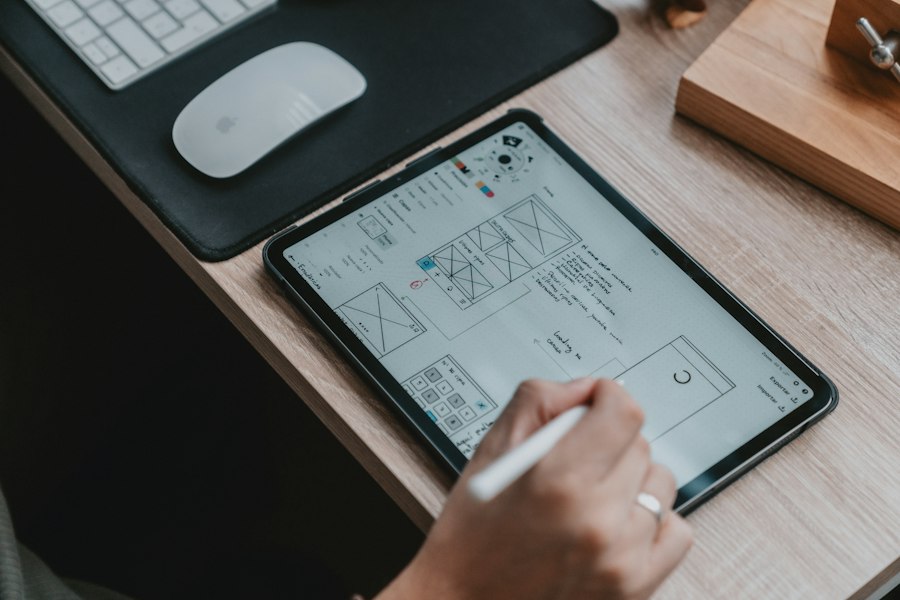
The minimalism trend isn't new, but in 2026 it's reached a new level. The best apps remove everything unnecessary: less text, fewer buttons, more white space. One screen — one action.
What works:
- Negative space — elements "breathe," the eye focuses on what matters
- Hidden menus — contextual actions appear only when needed
- Large typography — headings replace icons, text becomes navigation
- Monochrome palettes with a single accent color
Rule: if an element can be removed without losing functionality — remove it. Every pixel should work toward the user's task.
Gesture Navigation Instead of Buttons
With the disappearance of physical buttons and edge-to-edge screens, gestures have become the primary way of interaction. Swipes, long press, pinch-to-zoom — users expect gesture control by default.
Key patterns of 2026:
- Swipe for actions — delete, archive, share (like in email and messengers)
- Pull-to-refresh with animated feedback
- Bottom sheets instead of modal windows — pulled with a finger, don't block content
- Thumb zone design — all key elements within thumb reach
AI Interface Personalization
In 2026, AI stopped being a feature — it became an invisible UX layer. Apps adapt the interface for each user: rearrange element order, curate content, anticipate actions.
Examples from practice:
- Adaptive navigation — frequently used sections move higher
- Smart forms — auto-fill data, predictive input
- Contextual hints — AI shows the right action at the right time
- Personal dashboards — widgets rearrange based on habits
Important: AI personalization should be invisible. The user shouldn't think "oh, AI adjusted the interface." They should think "how convenient."
3D Elements and Micro-animations
Device performance allows using 3D without sacrificing speed. But the trend isn't about the "wow effect" — it's about functionality. 3D helps showcase products (e-commerce), explain complex things (education), or provide tactile feedback (gamification).

Micro-animations — small movements that make the interface feel alive:
- Skeleton screens instead of spinners — content "materializes"
- Haptic feedback — vibration confirms the action
- Element morphing — a button smoothly transforms into a form
- Scroll parallax — creates a sense of depth
Animation should last 200-500ms. Faster — unnoticeable. Slower — annoying. And never animate what the user is waiting for — data loading should not be animated.
What to Implement First
No need to implement everything at once. Prioritize by impact on business metrics:
- Thumb zone design — free, immediately improves usability
- Skeleton screens — eliminate the "laggy" feeling, retention grows by 5-10%
- Bottom sheets — replace modals, users stay in context
- AI recommendations — personalization increases conversion by 15-30%
- 3D/AR — only if it solves a specific task (try-on, visualization)
At Vitarum, we incorporate UX trends at the prototyping stage — before writing the first line of code. This saves up to 40% of the budget on rework and ensures the best user experience from the first release.
Want an App with the Best UX?
We'll conduct a UX audit of your app or design a new one from scratch
Discuss Project →